Understanding the Details Panel
The Details panel of a task provides a defined set of fields and controls to edit the task properties. It is shown in the following cases:
-
When you select a task in the Tasks area to shown the task details.
If you select a task in the Tasks area while its details are being displayed in the Details panel, the task details are reloaded.
-
When you click the Add button to create a task. See Creating Regular Tasks.
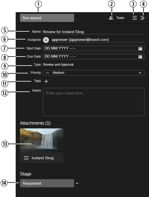
The following illustration and table provide an overview of the Details panel.
|
# |
Field/Control |
Description |
|---|---|---|
|
1 |
State |
The status of the task (In progress, Not started, or Completed). When you click on the field, a menu opens that lets you select another state. See Changing the Task State (List View). |
|
2 |
Access |
The task access category (read-only). In this version, Private or Team. |
|
3 |
Menu button |
Gives you access to additional features for the task open in the Details panel.
|
|
4 |
Hide Task Details button |
Closes the Details panel. |
|
5 |
Name |
Name of the task. For a Review and Approval task, "Review for <asset name>" is automatically set. To change the name, click in the field, type a new name and then click outside the field. |
|
6 |
Assignee |
The user to whom the task is assigned. This field is only shown for Team tasks. See Assigning a Task to Another User. |
|
7 |
Start Date |
Date and time when the task starts. When you click on the date, a calendar control opens. See Working with Date Fields. |
|
8 |
Due Date |
Due date and time of the task. When you click on the date, a calendar control opens. |
|
9 |
Type |
The task type (read-only). In this version, Regular, and Review and Approval. |
|
10 |
Priority |
The priority of the task (Low, Medium, Important, or Urgent). When you click on the field, a menu opens that lets you select another priority. See Changing the Task Priority (List View). |
|
11 |
Tags |
Tags assigned to the task. You can create new tags and select saved tags. See Using Tags. |
|
12 |
Notes |
Lets you to enter more descriptive data about the task. See Using Notes. |
|
13 |
Attachments |
The asset(s) attached to the task. Attachment handling is determined by the task type:
For more information, see Using Attachments. |
|
14 |
Action buttons |
Different buttons are shown depending on how the panel was opened:
|
Opening and Closing the Details Panel
You have two options to open the Details panel.
To open the Details panel, do one of the following:
-
Click on a task in the Tasks area.
-
Click the Add button.
The Details panel opens to the right side of the Tasks app. Except Type, which is always a read-only field, you can edit all fields in the Details panel if you have the required permissions.
To close the Details panel:
-
Click the Hide Task Details (>>) button on the right side of the Details panel header.
Working with Date Fields
When you select a field that requires you to enter a date, the Tasks app displays a calendar that you can use to enter your required values. As shown in the following illustration the calendar includes controls that allow you to quickly jump to specific days, months, or years.
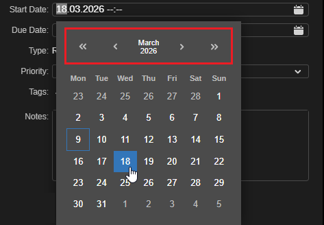
The following controls are available in the date picker:
|
Icon |
Purpose |
Description |
|---|---|---|
|
|
Back or Forward (large) |
Click these buttons to go back or forward by a larger amount of time. The increments change based on your current location in the calendar. For example if you are on the initial calendar page, these buttons advance the date by one year at a time. |
|
|
Back or Forward (small) |
Click these buttons to go back or forward by a shorter amount of time. The increments change based on your current location in the calendar. For example if you are on the initial calendar page, these buttons advance the date by one month at a time. |
|
Example:
|
Current Month and Year |
Appearing between the back and forward controls, you can click this button to display to a monthly view in which you can select a specific month within the current year. If you click the center button again, you can select a specific year (10 years displayed per page). In this case the back and forward buttons increment by either 10 or 100 years at a time. |
|
Example:
|
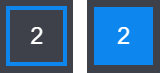
Current Day |
The calendar displays today’s date with a blue outline (shown left in this example). After you select a day, the value is highlighted in blue (shown right in this example). |


If you attempt to manually enter a value that is higher than the maximum possible value for that field, the app automatically replaces your entry. For example if you attempt to type 17 in the month field, the app replaces your value with 12 (December) — the maximum value allowed for that field.