Understanding the Rules Editor App Layout
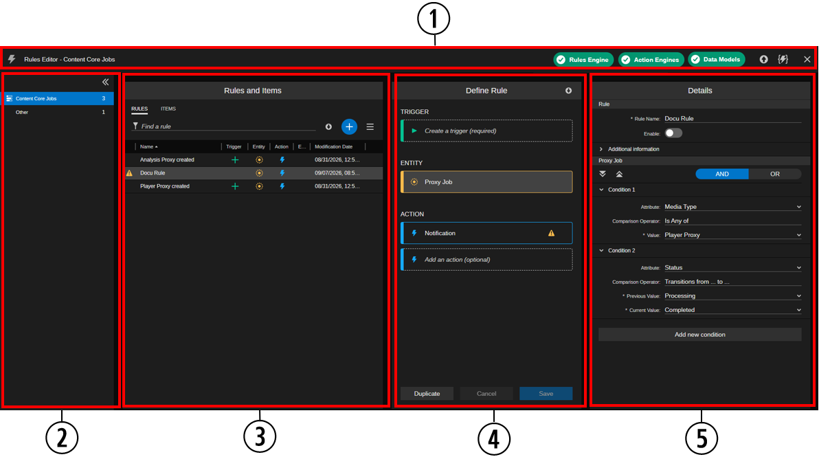
The Rules Editor app is divided between five primary areas, as described in the following illustration and table.
|
|
Section |
Description |
|
1 |
Rules Editor Header |
The header at the top of the app shows the name of the rule type selected in the sidebar and provides you with a health check of the back-end components that enable the functionality in the Rules Editor app. If ACC determines that the component is performing as expected, the header shows a green label for the component. If a problem is detected, the component might appear as yellow or red, depending on the severity of the issue. For more information, see Reviewing Rules Editor App Status Information. The Rules Engine pill can also be used for pausing and resuming event processing in the Rules Engine. See Pausing and Resuming Rules Engine Event Processing. The Open Simulator button shown at the right side of the Import Rules button lets you open the Rules Simulator window to test expressions and rules against defined change events. See Using the Rules Simulator for Consistency Checks. |
|
2 |
Sidebar |
Lets you select the rule type resp. system. The sidebar shows entries in the following order:
You can collapse and expand the sidebar. For more information, see The Sidebar. |
|
3 |
Rules and Items |
Information on the Rules and Items panel is arranged in two tabs:
For more information, see The Rules and Items Panel. |
|
4 |
Define Rule |
The Define Rule area lets you add the items to the rule: one trigger, one entity, and one or more actions. For more information, see The Define Rule Panel. |
|
5 |
Details |
This section of the app provides basic about the rule and additional information about the item selected in the Define Rule panel. This area allows an administrator to define the rule name, enable and disable the rule and to define conditions for the entity and properties of actions. For more information, see The Details Panel. |
The Sidebar
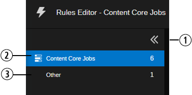
The Sidebar shows the rule types for which you can create rules. It also provides information on the availability of the rule type and number of rules. When you select a rule type, its rules are loaded into the Rules and Items panel.
|
|
Item |
Description |
|---|---|---|
|
1 |
Expand/Collapse toggle button |
Lets you collapse and expand the sidebar. |
|
2 |
Content Core Jobs |
Lets you define rules for Content Core Proxy Lifecycle Service jobs. |
|
3 |
Other |
The rule type Other shows uploaded rules that are unknown for the Rules Editor but can be executed by the Rules Engine; for example, rules that have been created via the API. For rules of type Other the Rules Editor app shows a simplified UI with a limited set of edit options. Usually this rule type is empty. For more information, see Using the Category Other. |
The rule types are displayed in the sidebar in the following order:
-
Content Core Jobs
-
Other
For each entry in the sidebar, an icon, the name and the number of created rules is displayed.
When you first access the Rules Editor app, the sidebar is expanded. If you do not need to access the rule types in the sidebar, you can increase the screen space for the other panels by collapsing the sidebar.
To collapse the sidebar:
-
 Click the Collapse button on the right side of the sidebar header.
The sidebar is collapsed and the other panels are moved to the left on the screen.
To restore the sidebar:
-
Hover the mouse pointer over the collapsed sidebar.
The sidebar is expanded as an overlay over the Rules and Items panel.
-
 Click the Expand button to dock the expanded sidebar.
All panels are restored on the original position.
The Rules and Items Panel
Information on the Rules and Items panel is arranged in two tabs:
-
RULES: Shows all created rules in an overview table. Use this tab to get an overview over the existing rules, create a new rule, export rules, delete existing rules, and select a rule for editing. See Layout of the RULES Tab.
After initial deployment, the Rules and Items tab is empty and shows the following message.
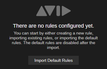
n The Import Default Rules option is reserved for future use.
-
ITEMS: Shows the items that can be added to a rule. The Items tab is automatically opened when you create a rule, double-click on a rule in the RULES tab, or click on a placeholder in the Define Rule panel. It can also be accessed after selecting a rule in the RULES tab. See Layout of the ITEMS Tab.
Layout of the RULES Tab
The RULES tab displays all rules that have been added to the Rules Editor app in an alpha-numerically sorted list. You can click on any of the rules to obtain more information about the rule and its items and to edit the rule. The RULES tab provides also controls to create, export and delete rules and to filter the rules list — allowing you to quickly and easily identify a specific rule. The following table lists the controls and information shown in the RULES tab.
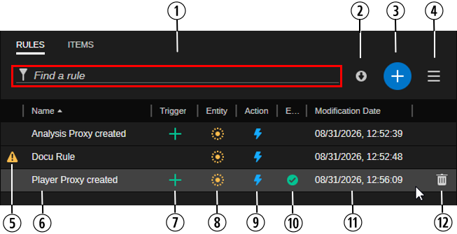
|
|
Item |
Description |
|---|---|---|
|
1 |
Find a rule |
The "Find a rule" filter option allows you to enter a custom value to limit the Rules list to show only those rules that include your filter text. See Filtering and Sorting the Rules List. |
|
2 |
Export all rules |
The button lets you export all rules. See Exporting Rules. |
|
3 |
Add new rule |
The Add new rule button allows you to create a new rule. When you click the button the Rules and Items panel switches to the ITEMS tab. See Creating a Rule. |
|
4 |
Menu button |
Shows the Import Default Rules option, which is currently not supported. |
|
5 |
Warning icon |
A warning icon is shown to the left side of a rule if the rule is missing a trigger, entity or action. When you hover your cursor over the icon, a tool-tip shows the missing item(s). |
|
6 |
Name |
Name of the rule. When you hover the cursor over the rule name a tool-tip displays basic rule properties. The same information is available in the Additional information section in the Details panel. |
|
7 |
Trigger |
The trigger assigned to the rule. Only one trigger can be assigned to a rule. When you hover the cursor over a trigger icon a tool-tip displays the trigger name. The following triggers are available: Created, Updated, and Deleted. |
|
8 |
Entity |
The entity assigned to the rule. Only one entity can be assigned to a rule. When you hover the cursor over an entity icon a tool-tip displays the entity name. The following entity can be added to a Content Core Jobs rule: Proxy Job. |
|
9 |
Action |
The Action assigned to the rule. You can assign a maximum of 10 actions to a rule. When you hover the cursor over an action icon a tool-tip displays the name(s) of the assigned action(s). The following action can be added to a Content Core Jobs rule: Notification. |
|
10 |
Enabled |
Indicates if the rule is enabled or not. If the green check mark icon is not shown, the rule is disabled. You enable and disabled a rule in the Details panel. |
|
11 |
Modification Date |
Shows the date and time when the rule was last modified. |
|
12 |
Delete button |
Lets you delete the rule. The Delete rule button is only shown when you hover the cursor over the rule in the table. See Deleting Rules. |
Information in the RULES tab is updated when you save a new rule, save changes made to an existing rule, import rules or delete a rule.
Filtering and Sorting the Rules List
The toolbar at the top of the RULES tab includes controls that allow you to execute certain actions that relate to the RULES tab.
To sort the Rules list:
-
In the Rules Editor's RULES tab, click on a column header to reorder the Rules list. The warning icon column does not support sorting.
 An up arrow appears to the right of the column name to indicate that this column is used to sort the results in ascending order.
 -
(optional) When you click on a column header, the column is sorted in ascending order. If you need to sort the list in descending order, simply click on the column header again to reverse the order of the list.
 A down arrow appears to the right of the column name to indicate that this column is used to sort the results in descending order.
To adjust the width of Rules list columns:
-
Click a column divider and drag it to the left or right.
Note that adjusting the column width affects rule types differently: A changed column width is only applied to the Content Core Jobs rule type; for the Other rule type, the column width can be adapted independently.
When you refresh the page or sign-out, the size of all columns is reset to the default value.
To filter the Rules list, do the following:
-
Enter a custom value in the Find a rule field.
The list of rules is filtered to include only those whose name include your filter text.
Layout of the ITEMS Tab
The ITEMS tab displays the items that can be added to a rule, arranged in tree sections: Triggers, Entities, Actions. All items in the ITEMS tab are represented by a card showing an icon and name.
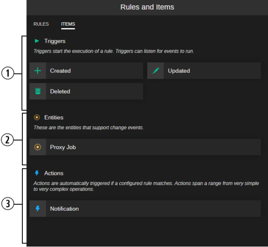
|
|
Item |
Description |
|---|---|---|
|
1 |
Triggers |
The Triggers section shows all triggers that can be added to the rule. When you click on a trigger card, the trigger is added to the rule and shown in the Define Rule panel under TRIGGER. Once you added a trigger to a rule, all triggers are disabled in the ITEMS tab. If you want to add another trigger to a rule, you first have to delete the currently assigned trigger from the rule. |
|
2 |
Entities |
The Entities section shows all entities that can be added to the rule. When you click on an entity card, the entity is added to the rule and shown in the Define Rule panel under ENTITY. Once you added an entity to a rule, all entities are disabled in the ITEMS tab. If you want to add another entity to a rule, you first have to delete the currently assigned entity from the rule. |
|
3 |
Actions |
The Actions section shows all actions that can be added to the rule. When you click on an action card, the action is added to the rule and shown in the Define Rule panel under ACTION. You can add a maximum of 10 actions to a rule. |
The Define Rule Panel
The Define Rule panel is opened when you create a new rule and when you select a rule in the Rules and Items panel's RULES tab. The Define Rule panel lets you add items to and remove items from the rule, export the rule, duplicate and save the new or edited rule.
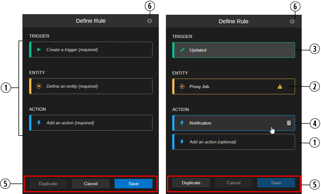
The Define Rule tab when starting to create a rule (left) and editing an existing Content Core Jobs rule with all changes saved (right)
|
|
Item |
Description |
|---|---|---|
|
1 |
Item placeholder |
When you create a new rule, the Define Rule panel provides placeholders for the items you can add to the rule: TRIGGER, ENTITY, ACTION. You add an item to the Define Rule panel by clicking on it in the ITEMS tab. The placeholder is then replaced by the name of the added item; only for ACTION an additional placeholder is displayed. |
|
2 |
Warning icon |
For any added Action, a warning icon will appear, for an Entity the icon might appear. When you hover the cursor over the warning icon, a tool-tip informs you which required configuration step in the Details panel still needs to be done. |
|
3 |
Selected item |
When you select an item in the Define Rule panel its details (conditions and properties) are shown in the Details panel. |
|
4 |
Hovered item with Trash icon |
If you want to replace an already added item, you first need to remove the initial item: hover the cursor over the item and click the Trash icon that is shown. After that, click on the item you want to add in the ITEMS tab. |
|
5 |
Buttons |
Execute operations on the rule currently being created or edited.
|
|
6 |
Export rule button |
Lets you export the rule currently being created or edit. The button is not activated until you have saved all changes in the rule. For more information, see Exporting Rules. |
The Details Panel
Information on the Details panel is arranged in two sections:
-
Rule: Basic rule information which is always displayed. See The Sidebar.
-
Items specific: Provides controls and information that are related to the item selected in the Define Rule panel. See The Define Rule Panel.
The Rule Section
The Rule section is positioned at top of the Details panel and is always shown for a rule. Its contents does not depend on the item selected in the Define Rule panel.
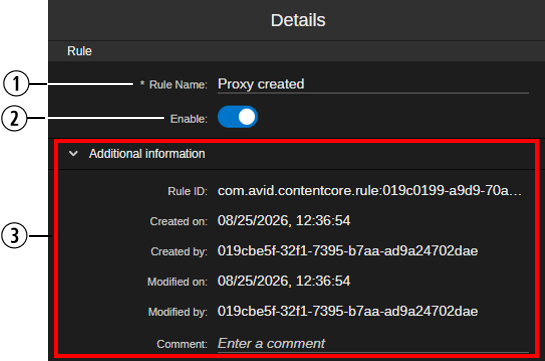
|
|
Item |
Description |
|---|---|---|
|
1 |
Rule Name |
Lets you define the name of the rule. |
|
2 |
Enable toggle |
Lets you enable and disable the rule. By default, a new rule is disabled. |
|
3 |
Additional information |
Provides basic information about the rule: Rule ID, Created on, Created by, Modified on, and Modified by. This information is generated by the backend and cannot be edited. You can enter a Comment (for internal use in the Rules Editor app) in this section. The Additional information can be collapsed and expanded. By default, Additional information is collapsed. |
The Item-specific Section
The item-specific section of the Details panel is displayed below the Rule section. It shows different controls and information depending on the item selected in the Define Rule tab: Entity or Action.
Note that the Details panel does not show a detail section for a selected trigger.
Entities
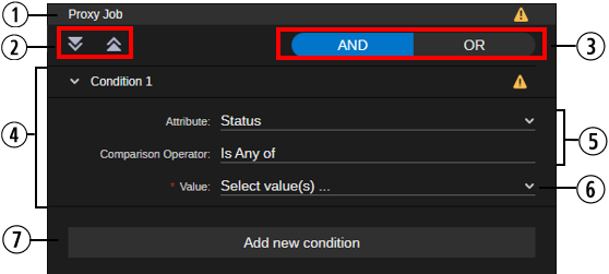
The entity-specific section of the Details panel shows the Conditions section. This section lets you define conditions for the selected entity. The supported conditions depend on the data type of the field. You can add a maximum of 10 conditions to the entity.
The following illustration shows the condition definition controls for the Content Core Jobs entity of type Proxy Job.
|
|
Item |
Description |
|---|---|---|
|
1 |
Header |
Shows the name of the entity to the left and might show a warning icon on the right side (a tool-tip summarizes the warnings from all conditions). |
|
2 |
Expand All / Collapse All buttons |
Let you expand and collapse all conditions. |
|
3 |
AND/OR buttons |
Let you define how multiple conditions are to be combined. |
|
4 |
Condition section |
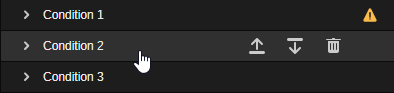
Each Condition is shown as a collapsible/expandible section, a warning icon might be shown to the right side (a tool-tip shows the reason for the warning). When you hover the cursor over the header of a condition, Move up/Move down and Delete condition buttons are shown.
The reordering of conditions has two purposes:
|
|
5 |
Fix condition definition controls |
The following controls are shown for all conditions:
|
|
6 |
Variable condition definition controls |
Depending on the selected Attribute and Comparison Operator, the following controls might vary or be not shown at all:
|
|
7 |
Add new condition button |
Lets you add a new condition section. You can add a maximum of 10 conditions. |
Actions
The action-specific section of the Details panel lets you define the parameters of the action to be executed, for example, a notification.
Which fields are shown is determined by the selected action specification. The Rules Editor uses the action specification to generate the layout for a specific action. If provided by the action specification, a tool-tip might display a description for individual properties.
In error cases – for example, the Action Engine is not available or loading of the action specification fails – new actions cannot be configured, existing action data of the rule are shown in read-only mode.
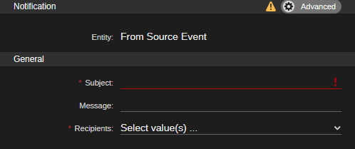
The following illustration shows an example for an action of type Notification. The warning icon in the header indicates that mandatory fields have not been populated yet. The Advanced toggle button hides an additional property that must not be changed.