Adding Titles and Graphics
The Editor app comes equipped with a sophisticated graphics tool that allows you to add keyframed titles and shapes to your sequence. Graphics can be saved as templates for future use, which can save you hours of time when designing highly complex or customized graphics.
Working with the Graphics Template Window
When you first add a new graphic or graphic template to your sequence, the Graphic Designer window opens in the source monitor. If you are working with an existing template, you might be able to make simple changes in this window (such as changing a line of example text), and your graphic is complete. Alternatively, you can click the Designer button to create and customize a new graphic.
Renaming your Graphic
The top of the Designer window shows the name of the graphic element. You can click within this field to rename the graphic. This process simply renames the graphic, it does not save it as a graphic template.
Exploring the Layers Window
After you click the Designer button to customize your graphic, the app displays the Layers window.
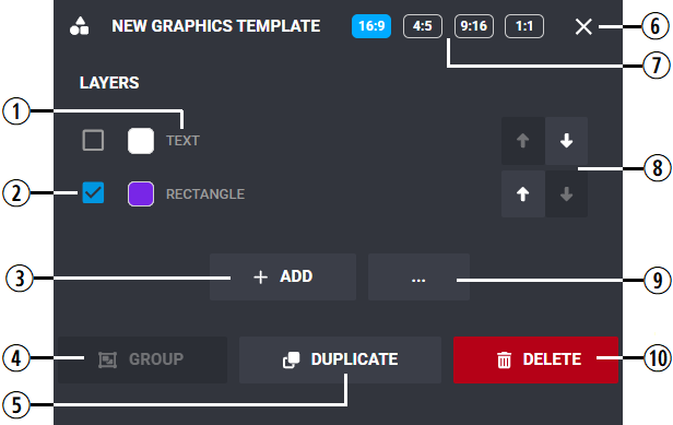
The following table explains the actions that you can perform in this window.
|
# |
Name / Description |
|---|---|
|
1 |
Icon / name of the layer. You can click on any layer to access it and reconfigure its attributes. |
|
2 |
Check boxes to select a layer. |
|
3 |
Add a new layer. n Text layers differ from Text box layers in that the former does not include the size attribute. |
|
4 |
If you select the check boxes for at least two layers, you can group them together. |
|
5 |
Select the check box next to a layer to allow the duplication of that layer. |
|
6 |
Closes the Graphic Designer. |
|
7 |
Aspect Awareness Buttons. For more information, see Using the Aspect Awareness Controls. |
|
8 |
The arrows allow you to bring layers to the front, or push them to the back. |
|
9 |
Additional actions menu includes the following options:
|
|
10 |
Select the check box next to a layer to allow the deletion of that layer. |
Using the Aspect Awareness Controls
When you add a new graphic, the Editor app automatically adapts the graphic to fit the format of each output type. However, it is possible that the graphic's default attributes might not be optimal for your specific need. The Aspect Awareness controls allow you to customize how your graphic looks for each aspect ratio.
For example if you create a title in the bottom-left corner of a 16:9 output, that same graphic might appear in a different position of a 9:16 output. The following illustration provides a visual example of this situation.
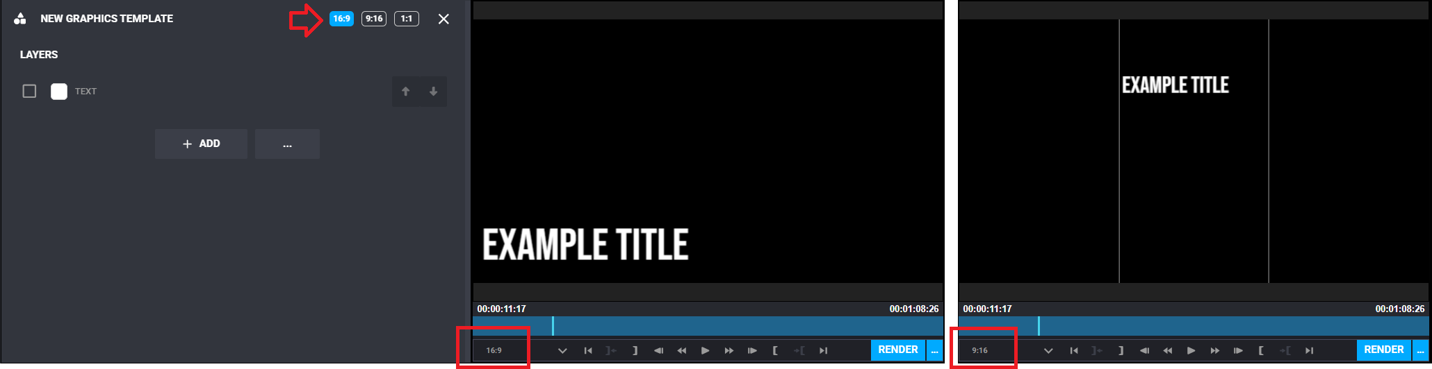
Using the Aspect Awareness controls, you are not only able change the position of the title, but also certain aspects of the graphic that are aspect aware. In the following comparison illustration, the editor has moved the 9:16 graphic to the bottom of the screen and changed its size and color — without affecting the original 16:9 graphic.
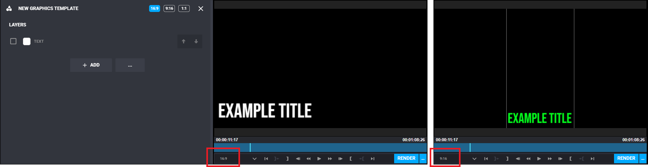
Some graphic attributes can be changed only in the original 16:9 formatted graphic, and these changes affect all aspect ratios. After making such a change, you might be required to revisit and update the graphic in the other aspect ratios.
To use the Aspect Awareness controls:
-
Using the default 16:9 format, add and customize your graphic using the concepts explained in this section of the documentation.
-
Select a different aspect ratio in the Graphic Designer and make any changes for that format.
-
Repeat the previous step for all aspect ratios.
-
When complete, cycle through the aspect ratio buttons to verify that your output is correct for each format.
Understanding the Designer Options
The Designer allows you to customize new or templated graphics. The following illustration shows an example title with some of the controls available in the Graphics Designer tool.
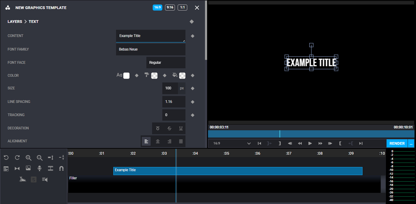
The following table describes the controls available in the graphic designer. The Applicable column defines if the control is applicable to Text (T), a Text Box (TB), Image (I), and/or Shape (S).
|
Name |
Description |
Applicable |
|---|---|---|
|
Upload Image |
Select this button to import an image file to be used in the graphic. In addition to using images with other graphic elements, this feature can be useful to add a company logo or bug to your final output, or for creating a general picture-in-picture effect. Any images that you upload through this tool are available only in this project and only in this graphic. The assets do not appear in the Project Bin and you cannot search for them through other areas of Avid Content Core. If you need to use the same image in another graphic, you must re-upload it. |
I |
|
Content |
This is your title text. You can press Enter to type multiple lines of text. If you enter enough text so that it does not fit on the screen, a vertical scroll bar appears to the right. You can see more text on-screen at the same time by using your mouse to drag the bottom-right corner of the text field down. |
T, TB |
|
Font Family |
Defines the font used for this text. When you click this field, a menu appears with sorting and searching options. For more information, see Font Options Window. |
T, TB |
|
Font Face |
If the options are available, this determines the font face. For example Regular, Bold, or Italic. |
T, TB |
|
Color |
Defines the text color, background and fill. For more information, see Designer Color Options. |
T, TB, I, S |
|
Corner Radius |
(Rectangle only) If you create a rectangle, this alters the rounding of the corners. The default is 0x0, but if for example you changed the values to 50x50, the shape might have rounded edges. If you increased this to an extreme amount, such as 500x500, the rectangle might appear more like an oval. |
S |
|
Radius |
(Circle only) Changes the size of the circle. |
S |
|
Angle |
(Circle only) Changes the shape of the circle. For example, values of 180 x 360 would result in a half circle with the upper-half exposed. If you inverted those values, you would see the opposite result. |
S |
|
Size |
Font size (measured in pixels) |
TB |
|
Line Spacing |
If you have multiple lines of text, this determines the amount of space between each line. |
T, TB |
|
Tracking |
Determines the amount of space between each character. |
T, TB |
|
Decoration |
This feature allows you to add a line above the text, below the text, or add a strike-through. |
T, TB |
|
Alignment |
Aligns the text to Left, Right, Center, or Justified. |
T, TB |
|
Flip |
Flips the text vertically or horizontally. |
T, TB |
|
Background |
Adds a background to your title and allows you to control the llok of that background. |
T, TB |
|
Opacity |
Sets the object transparency from solid (100) to opaque (0). |
T, TB, I, S |
|
Anchor |
Centered by default, these settings allow you to adjust the rotation anchor point. For example if you adjusted the controls to the top-left as illustrated below, you could use the controls to center the rotation by that new point.
This option can also be used in conjunction with the Pin feature. |
T, TB, I, S |
|
Positions |
Allows you to change the position of the object on-screen. You can also move the object directly in the Record monitor using a drag and drop method. If you move the object using the mouse, you might notice yellow horizontal and vertical lines appear to show the exact center of the frame. You can slowly drag the object to snap to these points. |
T, TB, I, S |
|
Size |
Adjusts the size of the object. If you are working with Text or a Text box, this control affects the text font size. You can also change the size of the object directly in the Record monitor. |
T, TB, S |
|
Scale |
Stretches the object vertically and / or horizontally. |
I, S |
|
Angle |
Adjusts the object's rotation. You can also adjust the rotation directly in the Record monitor using a drag and drop method. |
T, TB, I, S |
|
Skew |
Skews or tilts the object vertically and / or horizontally. |
T, TB, I, S |
|
Blending |
Allows you to add masking effects. For example, you could create a simple mask by doing the following:
|
T, TB, I, S |
|
Order |
If your graphic includes multiple elements, these buttons allow you to bring objects forward, or send them backwards. The Layers page of the Graphics Template window includes up / down arrows next to each element that also allow you to control the object order. |
T, TB, I, S |
|
Pin To |
Allows you to pin (group) two or more items together. For example if you pin a rectangle to a text object, the rectangle automatically follows the text object, or expands automatically as you enter new text. The Edge options determine the follow direction. For example, selecting the left and right edge options allows the rectangle to follow the text on a horizontal plane. If you enable this option and you move the text up or down, you are allowed to move the text outside of the rectangle. If you select all four Edge options, the objects are locked together. n Using the example above, if you pin the two example elements in the reverse order, the rectangle does not expand if you add new text. |
T, TB, I, S |
|
Mask |
Works similarly to the Pin To feature. |
T, TB, I, S |
|
Stroke |
Allows you to apply a boarder around the object. |
T, TB, I, S |
|
Shadow |
Allows you to apply a drop shadow to the object. |
T, TB, I, S |

Font Options Window
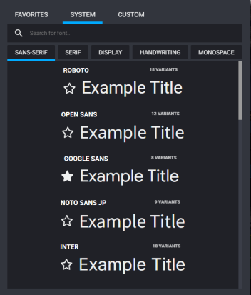
When you click the Font Family option in the Graphics Designer, the system displays a pop-up window with additional selection and search options. As shown in the following illustration, the window includes Favorites, System (shown), and Custom tabs.
-
Favorites: Lists any fonts that you identified as a favorite.
You can click the Star button to the left of any font in the System tab to select it as a favorite. In the example illustration above, the user has selected Google Sans as a favorite.
-
System: Allows you to browse, search, and select the font to be used in your graphic. The list of fonts note the number of variants that are available for that font. You can select the variant using the Font Face menu in the Graphic Designer.
The tabs within the System tab divide the fonts into different categories.
-
Custom: Avid Content Core comes with a default set of open source fonts. These fonts have no relationship with any fonts installed on your local workstation. The Custom tab allows you to import a font from your local Workstation to Avid Content Core. Once imported, the font is available in the Graphics designer for all Avid Content Core users.
Supported font formats include:
-
Web Open Font Format (WOFF)
-
Open Type Format (OTF)
-
True Type Format (TTF)
Fonts that include multiple variants might be enclosed in a compressed file format, such as .zip. You must first uncompress the file and import one variant at a time. After the import, fonts are grouped into a single family with variants.
-
Designer Color Options
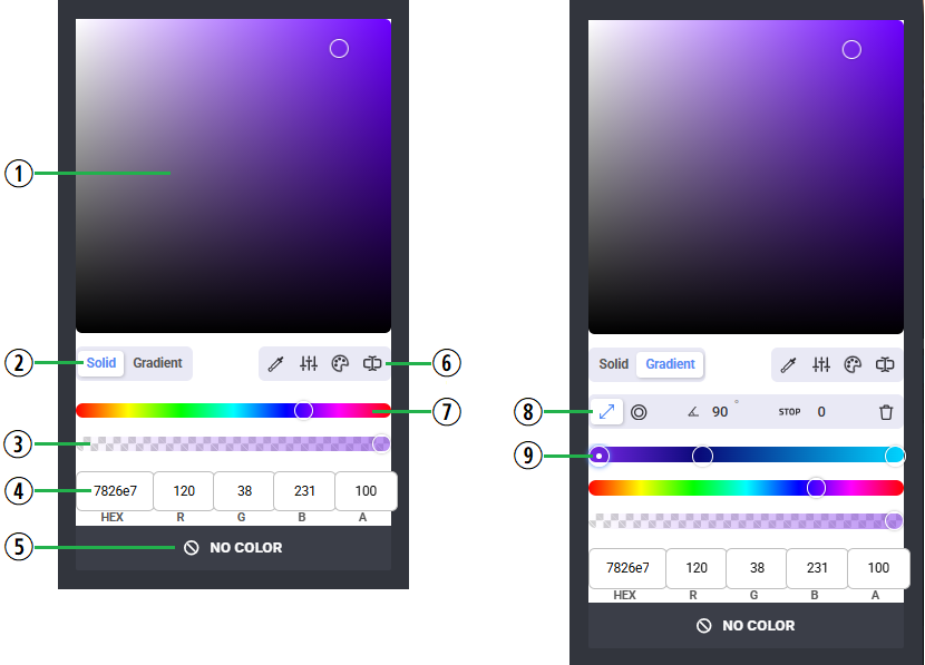
When you select any of the color options in the Graphics Designer, the app displays an additional window the provide you with precise controls over the color selection process.
The following illustration and table describe these options.
|
# |
Name / Description |
|---|---|
|
1 |
Color picker swatch. You can use your mouse to select a color from the palette. |
|
2 |
Solid and Gradient buttons |
|
3 |
Opacity selector |
|
4 |
Color values. If you know the HEX number of a specific color, you can type it into the HEX text box. Additionally, you can enter values into any the text boxes (0-255 for RGB, 0-100 Alpha). |
|
5 |
You can click the No Color button to change the color value to black. |
|
6 |
Additional controls:
|
|
7 |
Color range selector |
|
8 |
(Gradient) The gradient toolbar includes the following features:
|
|
9 |
(Gradient) Allows you to set gradient keyframes so that you can transition between multiple colors. The following example illustration shows three colors, represented by three points on the color picker.
You can add more keyframes by clicking on the bar. |
 Eyedrop tool — Allows you to select a color from anywhere on your screen (not just within the browser window)
 Sliders — Reveals Saturation, Lightness, and Brightness controls
 Color Guide — Shows how your selected color falls into Analogous, Monochromatic, Triad, and Tetrad ranges
 Color Space — Allows you to select between RGB, HSL, HSV, and CMYK color spaces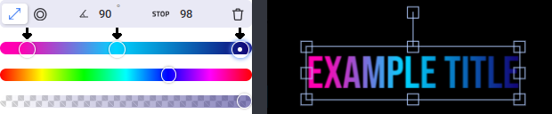
Designing a Simple Graphic
The following process explains how to add a simple graphic to your sequence.
To add a simple title or graphic to your sequence:
-
Load a sequence into the Sequence Timeline.
n Your sequence must include at least one video asset in the Main track before you can add a graphic.
-
Move your position bar on the timeline to act as an In point for this edit.
-
Click the Insert Graphic button, or press Shift+G on the keyboard.
The new graphic appears both on the timeline and in the Record monitor, and the New Graphic Template window appears in the Source monitor. For more information about those controls, see Working with the Graphics Template Window.
-
Click the Designer button and then do one of the following:
-
To the right of any check box, click a layer to select that element of your graphic for editing.
For example, if you have a graphic that consists of a line of text and a shape, you can select either the text or the shape to edit either element.

-
Click the graphic element in Record monitor.
The controls for that layer appear in the Source monitor. The controls that appear in the designer might vary based on the type of object type you select. For example if you select a text object, you see options for Font, Line Spacing, and more that would not be available if you select a shape — such as a rectangle.
-
-
Adjust your graphic element using the controls in the Designer.
-
Click the X in the upper-right corner of the Designer to close and save your changes.
Keyframing Graphics
The Graphics Designer allows you to keyframe many of the graphic attributes so that you can animate them across the duration of the segment. For example, you could create a rolling title crawl, or create more complicated graphics that fly onscreen, or fade up and down.
You can add as many keyframes as you need for each attribute. If you have multiple elements, such as a shape and a title, you can also group these elements so that you need to apply only one set of keyframes.
To keyframe graphics:
-
Create your initial graphic element, using the process for Designing a Simple Graphic.
-
(optional) If you have multiple elements, you can group them before adding keyframes.
-
Open the graphic and click the Designer button.
-
Select the check boxes to the left of the elements that you want to group.
-
Click the Group button.
The Layers view of the Designer should now show a GROUP: <name> element.
When you group elements, only those attributes that are common to all elements appear. For example if you group a title and a shape, options like Content and Font are disabled. If you need to make changes, you can click the Ungroup Objects button in the Designer.
-
-
(optional) Move the position indicator bar to the point in the graphic where you want your first keyframe.
If you add a keyframe without completing this step, you can drag and drop the first keyframe to a different position after it has been created.
-
 Click the keyframe button to the right of any attribute that includes this option.
The following example illustration shows the first keyframe added to the Opacity attribute.
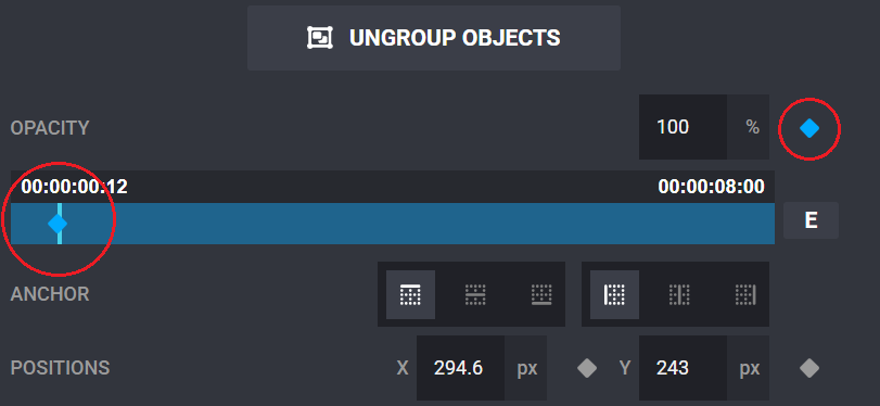
n Some attributes might have multiple keyframeable elements that result in multiple rows of information. For example, the Positions attribute includes separate options for X and Y values.
-
If necessary, adjust attributes for this keyframe.
-
Click another point in the blue mini-timeline within the Graphics Designer window to select a point for your next keyframe.
-
Click the Keyframe button again and adjust the attributes for this keyframe.
You can repeat these steps to add ad many keyframes for as many attributes as you need. Alternatively, you can click a keyframe to select it and then press the Delete key on your keyboard to remove it.
-
When ready, click the X in the upper-right corner of the Designer to close and save your changes.
Deleting a Graphic or Graphic Element
To delete a graphic from the timeline:
-
Click the segment in the Sequence Timeline to select it, and press Delete or Backspace on the keyboard.
To delete one or more graphic layers:
-
Double-click the graphic to open the Designer.
-
Click the Designer button.
-
Do either of the following:
-
Select the element (such as a shape) in the Record monitor, and press Delete or Backspace on the keyboard.
-
Select the check box to the left of the element, press the Delete button, and click Yes to confirm the action.
-