Using Filters
The Filter option in the Search sidebar enables you to limit search results based on commonly used metadata fields such as duration, asset type, and more. These filters are similar to the options available through the Search Type menu. However unlike search terms, filters are paired with non-customizable modifiers.
For example, the Created filter (illustrated below) includes a set of predefined, non-modifiable date ranges. If you select the same Dates:Created option through the Search Type menu, you can customize the term to include a specific date or date range.
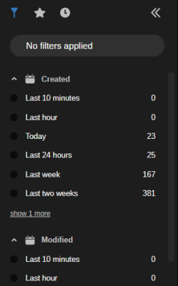
Each item in the Filters tab is displayed with a filter name and associated qualifiers. For instance, the Created filter includes qualifiers such as Last 10 Minutes, Last 24 Hours, and others. The number to the right of each filter indicates how many assets match this filter.
The Created and Modified filters both include Today and Last 24 hours filters. While the Last 24 hours filter displays assets for a 24 hour period, the Today filter displays only those assets created or modified between 12:00am and the current time. You should note that these filters respect the time zone of the local client. This means that if you are working with a coworker in a different time zone, their search results might be different than yours.
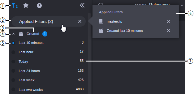
You can click the name of the filter or button to the left of it to add the filter to your search. When you make a selection, the filter is applied immediately and the search results area is populated with matching assets. Additionally, the Filter button in the sidebar header and the Applied Filters button are both updated to reflect the change. The following illustration shows the Filter menu with two filters enabled.
|
|
Name |
Description |
|
1 |
Filter button |
When you select a filter, a number appears to the right of this icon to indicate the number of filters currently enabled. |
|
2 |
Applied Filters |
Displays the number of applied filters. If you click this button, the Applied Filters fly-out window appears. If you click the X on the right of the Applied Filters button, the Filter list is reset and all filters are cleared from your search. |
|
3 |
Filter Name |
Displays the category label. |
|
4 |
Expand / Collapse |
Click the button to the left of the filter name to collapse or expand this filter category. |
|
5 |
Qualifier selection box |
Used to enable and in some cases disable a filter. When enabled, one of two types of marks appears in the selection box:
|
|
6 |
Applied Filters (fly-out) |
If you click on the Applied Filters header, a fly-out window provides more detail on the selected filters. You can click the X to the right of any filter to remove it from the list. |
|
7 |
Asset count |
Displays the total number of assets that match this filter. This count is based on the number of assets in the database and not based on your current search. If you select multiple filters, these values remain the same. For example if you have 10 master clips out of 100 that have been created in the last 24 hours, the total master clip counter does not change if you add the 24 hour filter. In this case the counter would still show 100 and not the subset of assets created in the last 24 hours (10 master clips). |
n You cannot modify or customize the list of filters.
The sidebar displays up to six selections for each filter category by default. In some cases such as the System and Type filters, the app might display a “show more” or “show all” button that allows you to select from additional filter options. If the category includes six or fewer additional selections, you can click the Show More button to expand the category directly within the sidebar. If the category is associated with more than six options, you can click the Show All button to open a break-out window that displays all possible filters for that category.
If the list of filters extends beyond the size of the window, a scroll bar appears to the right of the list that allows you to navigate to the additional filter options.
System Filter
This category displays the names of each local or remote system that is connected to Avid Content Core. The Avid Content Core Web Editor is an example of a local system, whereas an on-prem MediaCentral Cloud UX deployment is an example of a remote system.
If you are connected to a MediaCentral Cloud UX system that is configured for Avid Production Management, Production Management shows the database name (apm-db) along with the name of the MediaCentral Cloud UX system — as it is defined in the Avid Content Core Site Registry app.